|
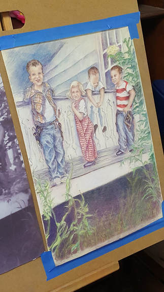
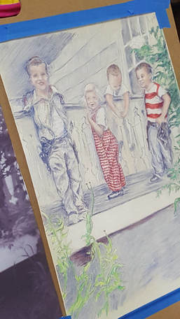
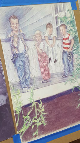
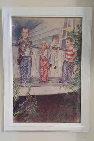
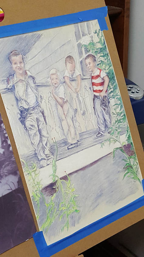
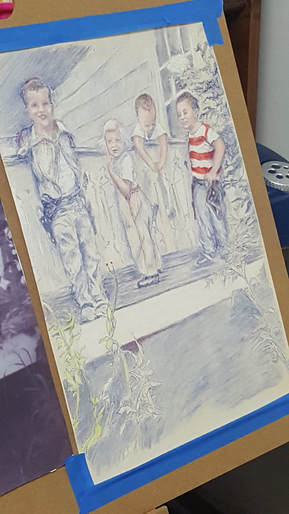
On my previous post, I had started to add some color to the blue and white under-painting on "Just Hanging Around". Now, I get to continue the fun deciding what colors I should use. Before adding the color, I sprayed the piece with workable fixative to keep all that blue from smudging. I decided the little girl should have red and white checks on her overalls. I also started working on the plants surrounding the kids. I've got a bit more done here. Boys now have blue jeans and the boy on the left is getting a red, blue and yellow plaid shirt. Hmmm...I seem to have a theme here with the colors. Guess I like primary colors. I've continued working on the plants and started to darken the area under the porch. Pretty much done here. I've added more color all around and darkened the area under the porch. I've also added grass to connect the plants. After all, if any of the kids fall off the porch, they need a soft place to land. TaDa! Here it is all framed and ready for its appearance at the show. This is a piece I had been wanting to do for a while now so I am so glad to complete it.
Now, off to the next project!
2 Comments
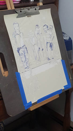
Sometimes no matter what you do, there comes a time when you just need to start over. I found this out with my piece "Just Hanging Around." My first start with this artwork was done on cradled board that I had prepared with a special primer to give the surface some texture for the colored pencil to take hold. Unfortunately, I gave it too much texture and could never get the layers and details the way I wanted no matter what I did. After a deep breath, I took the plunge - start again! Luckily, I still had my original sketch to be able to transfer to my new surface. This time I used Uart sanded pastel paper 500 grade. This paper has a uniform texture with a wonderful velvety feel. Colored pencil, as well as pastel, work wonderfully on this surface. Here you can see where I started again: So, here I am starting my drawing again. Since I'm working from an old black and photo from the 1950's, I thought it might be interesting to do a monochrome under painting. Here I am using Faber-Castell Indanthrene blue as well as the white color pencils. It gives a feel of the previous decades without using black and white. Even though I liked the look of the blue and white drawing, I decided I needed to add color. Since my reference for this project was an old black and white photo, I had fun deciding what colors to use. I started lightly with the skin tones and then went right to the red stripes on the boy's shirt. He must have been wearing red and white, right?
On the next post, we'll see what other colors I come up. |
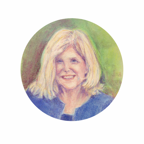
AuthorSusan Hilton is a Scarborough, Maine artist who enjoys drawing the people and places around her. Archives
January 2022
Categories |

 RSS Feed