|
Since we're starting a New Year, let's look forward with a fresh perspective and think positively as we venture forth. With that in mind, I thought you might enjoy a short time lapse of a character I created. I did this on my iPad with Procreate and my trust Apple Pencil. Hope you enjoy it!
7 Comments
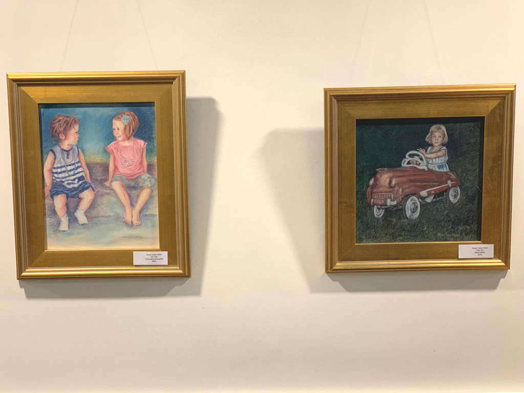
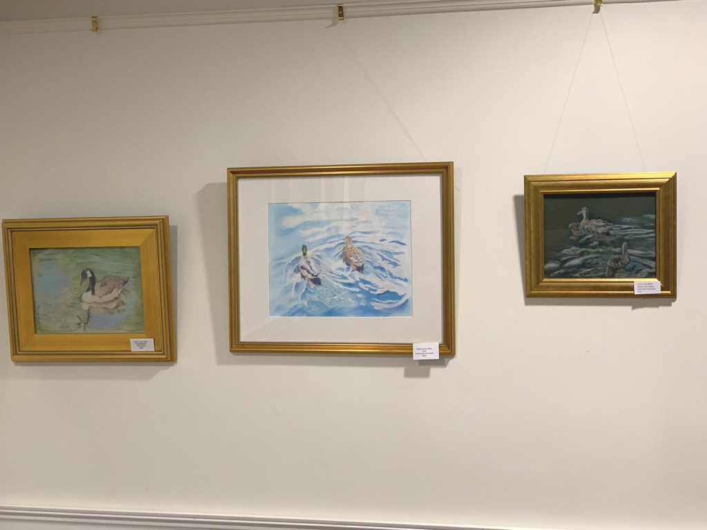
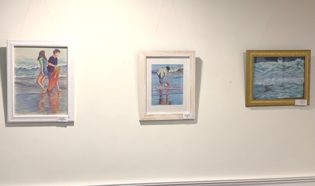
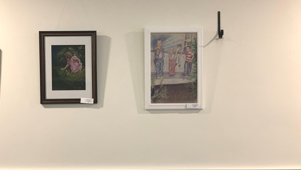
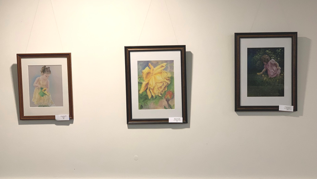
What’s better than a good cheeseburger for lunch? How about some nice art with that meal? I have the privilege of exhibiting twelve pieces of my artwork at Maine Medical Center’s Pavilion Grill. The Grill is a coffee shop/restaurant run by one of the hospital’s non-profit auxiliaries. Proceeds are used for medical scholarships and other projects to benefit the hospital. Patients, families, visitors and hospital staff all enjoy going there for great sandwiches, salads and more. The Pavilion Grill also has a rotating exhibit of local artists’ work. Now my work is making an appearance on these walls. You can see photos of the artwork below: If you’re in the area, stop in at the Pavilion Grill at Maine Medical Center at 22 Bramhall Street in Portland, Maine. You can have a nice lunch and see the artwork in person. Enjoy!
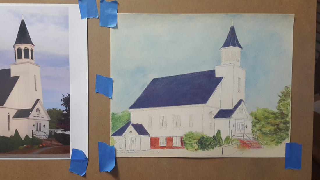
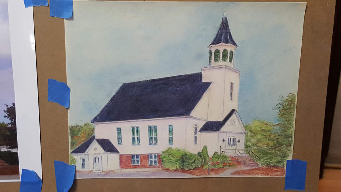
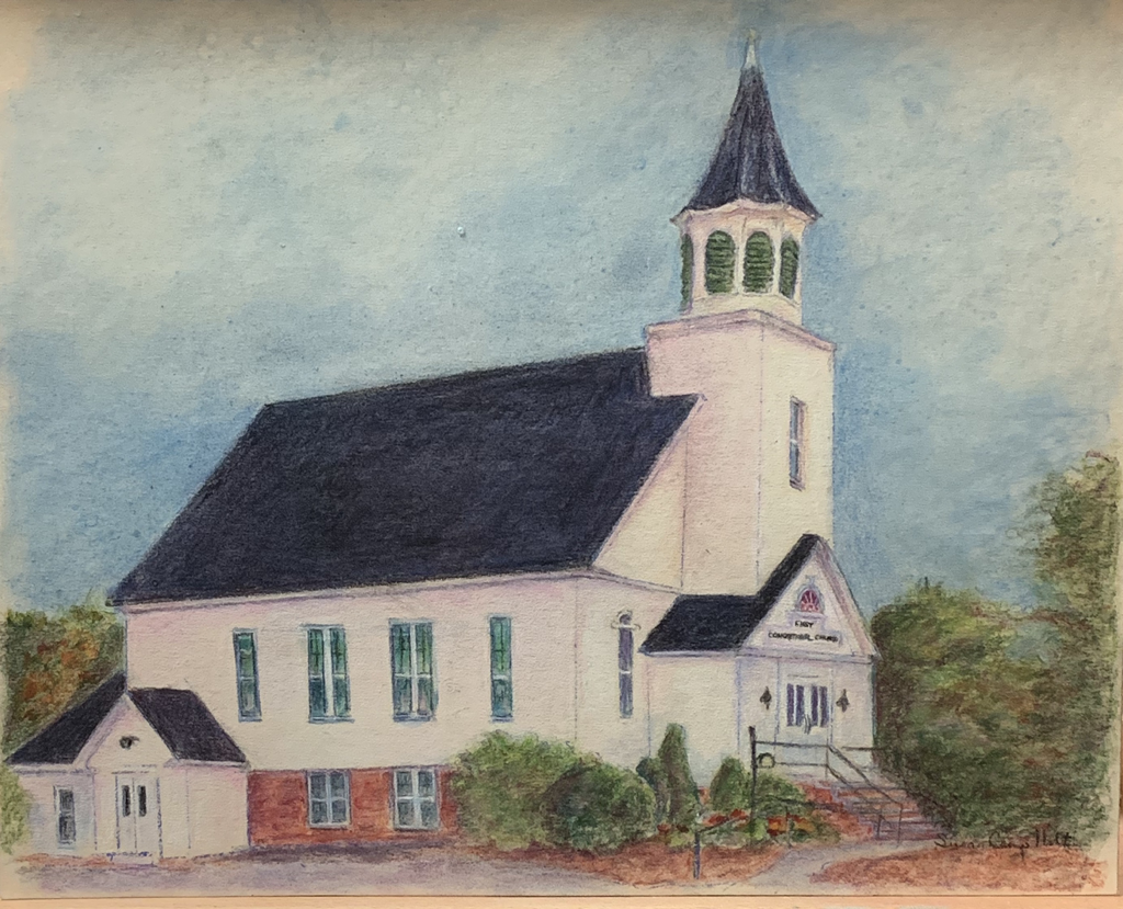
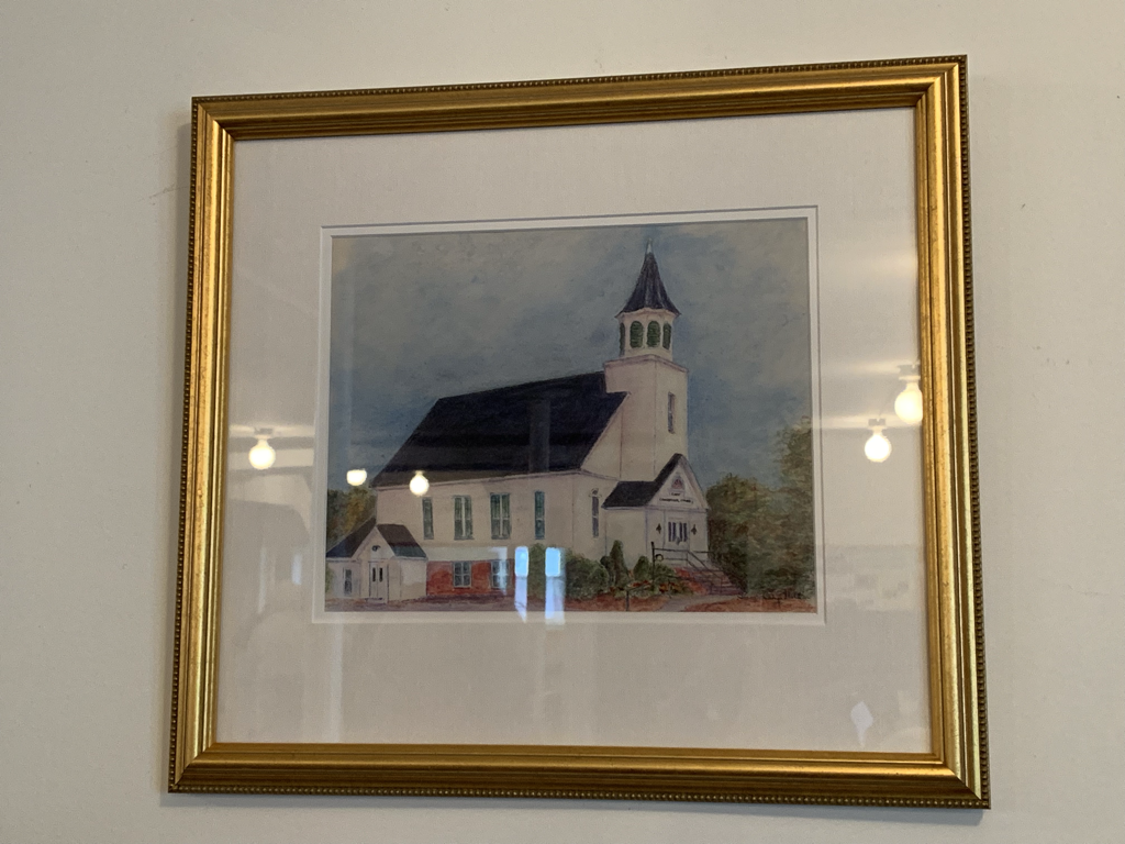
We love to celebrate birthdays especially kids, counting down to when they are 5 or 10 years old. As we get older, we celebrate milestone birthdays like 50, 60 and even up to 100! However, can you imagine a 290th birthday? Well, recently a church in my area celebrated its 290th birthday! Can you imagine? That is quite a feat to still be in existence after all that time. Definitely worth acknowledging. As part of the celebration event, I was commissioned to draw the church. The time frame was short but I was pleased to be able to do this piece for the event. Below you can see my process: 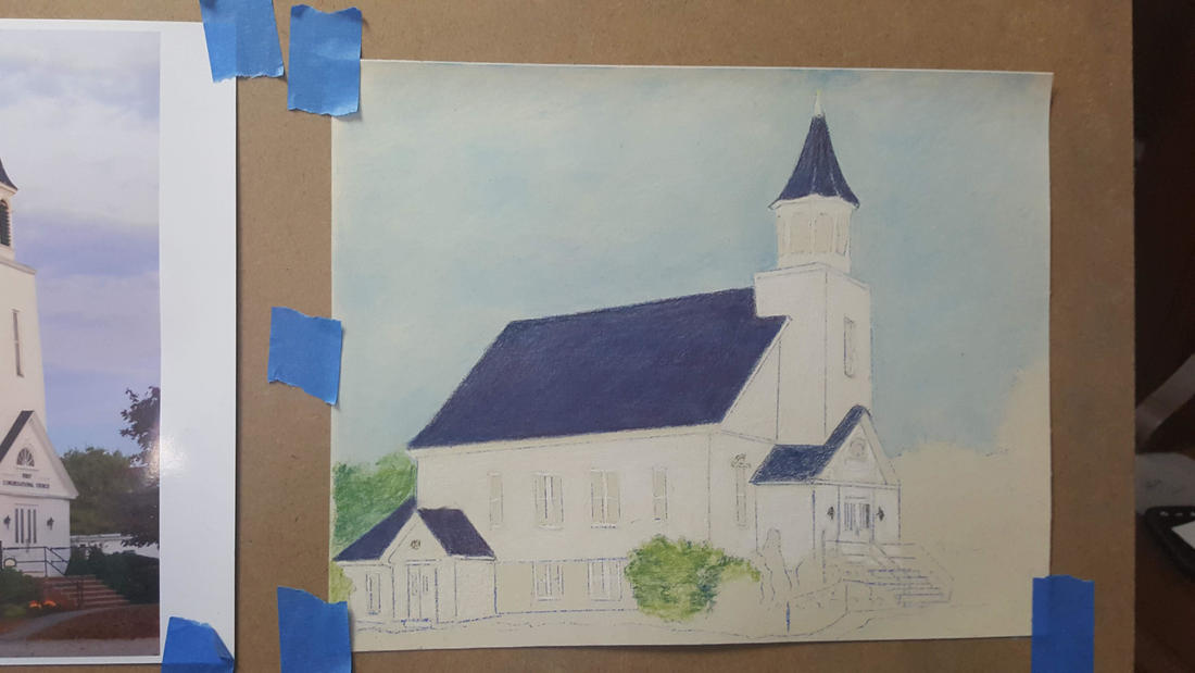 Here I have my sketch transferred to 8 x 10 sanded pastel paper and taped to the drawing board (that blue painter's tape is nice to use; easier to get off when I'm done). I like the texture of this paper. The color pencil will blend almost like pastel. Here, I have started with the sky and then the dark roof and white church. 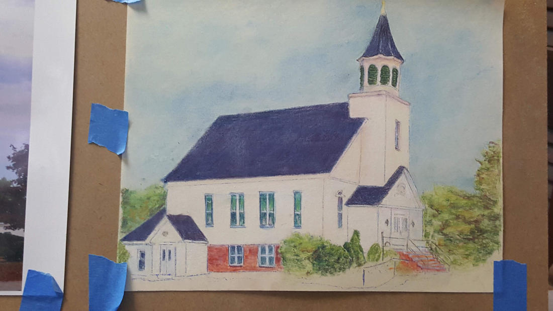 It wasn't until I started working on this drawing that I realized there were green shutters in the steeple. Amazing the things I find once I study a photo to create artwork. I also decided to add aqua and blue to the windows because I wanted to show the light within shining out. I've also started to add a little more color and shadows to other areas. 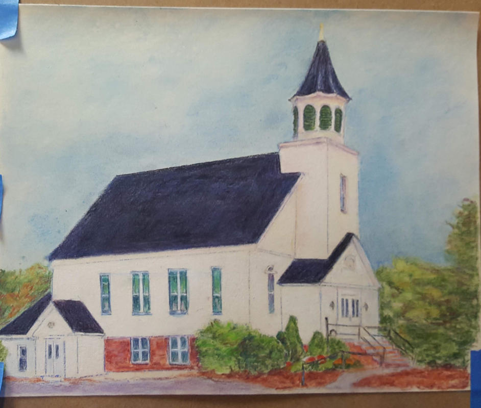 More filled in here. More color and shading everywhere to build depth. I'm using pinks and a light lavender color for the shadows. I've added the lawn area and part of the parking lot to help ground the building. You'll notice I didn't use gray for the parking lot area. That looked too boring to me. I decided for various purples, pinks and blues. I like that much better. I was happy that I was able to do this artwork to celebrate the 290th birthday of the First Congregational Church of Scarborough. It was really a fun event. You can see some pictures and video at www.facebook.com/fccscarbourough/ Upon request, I have also created notecards and prints of this drawing and they are available for purchase. I will donate a portion of all sales of these items to the First Congregational Church of Scarborough. Thanks! Church note cards - Boxed set of 6
$18.00
These note cards were created from the original colored pencil artwork commissioned for the 290th anniversary of the First Congregational Church Scarborough. The boxed set includes six 5 x 7 cards with a premium glossy surface to enhance the cover image. The inside has a matte finish making it easy to write on. A portion of all the sales will be donated to the church.
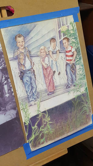
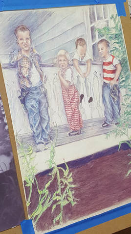
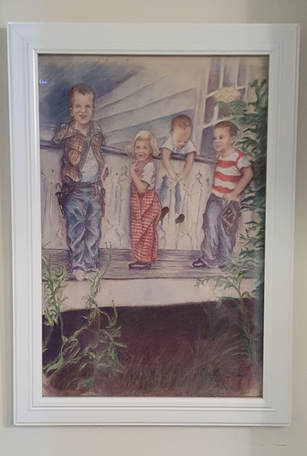
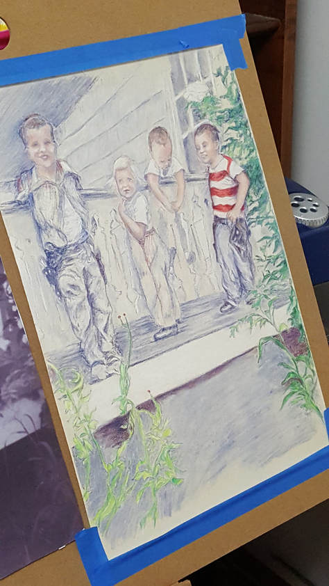
On my previous post, I had started to add some color to the blue and white under-painting on "Just Hanging Around". Now, I get to continue the fun deciding what colors I should use. Before adding the color, I sprayed the piece with workable fixative to keep all that blue from smudging. I decided the little girl should have red and white checks on her overalls. I also started working on the plants surrounding the kids. I've got a bit more done here. Boys now have blue jeans and the boy on the left is getting a red, blue and yellow plaid shirt. Hmmm...I seem to have a theme here with the colors. Guess I like primary colors. I've continued working on the plants and started to darken the area under the porch. Pretty much done here. I've added more color all around and darkened the area under the porch. I've also added grass to connect the plants. After all, if any of the kids fall off the porch, they need a soft place to land. TaDa! Here it is all framed and ready for its appearance at the show. This is a piece I had been wanting to do for a while now so I am so glad to complete it.
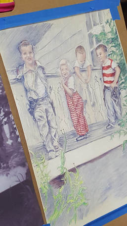
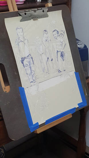
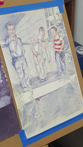
Now, off to the next project! Sometimes no matter what you do, there comes a time when you just need to start over. I found this out with my piece "Just Hanging Around." My first start with this artwork was done on cradled board that I had prepared with a special primer to give the surface some texture for the colored pencil to take hold. Unfortunately, I gave it too much texture and could never get the layers and details the way I wanted no matter what I did. After a deep breath, I took the plunge - start again! Luckily, I still had my original sketch to be able to transfer to my new surface. This time I used Uart sanded pastel paper 500 grade. This paper has a uniform texture with a wonderful velvety feel. Colored pencil, as well as pastel, work wonderfully on this surface. Here you can see where I started again: So, here I am starting my drawing again. Since I'm working from an old black and photo from the 1950's, I thought it might be interesting to do a monochrome under painting. Here I am using Faber-Castell Indanthrene blue as well as the white color pencils. It gives a feel of the previous decades without using black and white. Even though I liked the look of the blue and white drawing, I decided I needed to add color. Since my reference for this project was an old black and white photo, I had fun deciding what colors to use. I started lightly with the skin tones and then went right to the red stripes on the boy's shirt. He must have been wearing red and white, right?
On the next post, we'll see what other colors I come up. |
AuthorSusan Hilton is a Scarborough, Maine artist who enjoys drawing the people and places around her. Archives
January 2022
Categories |



 RSS Feed